OVA Character Record

Discuss rule quandaries, supplements, or anything else OVA related here.

Moderators: Clay, Jade

Post Reply
Clay
Dangerously Sane
Posts: 1282
Joined: Sun Jun 27, 2004 4:32 pm
Location: Nowhere-land
Contact:

OVA Character Record

Post by Clay »

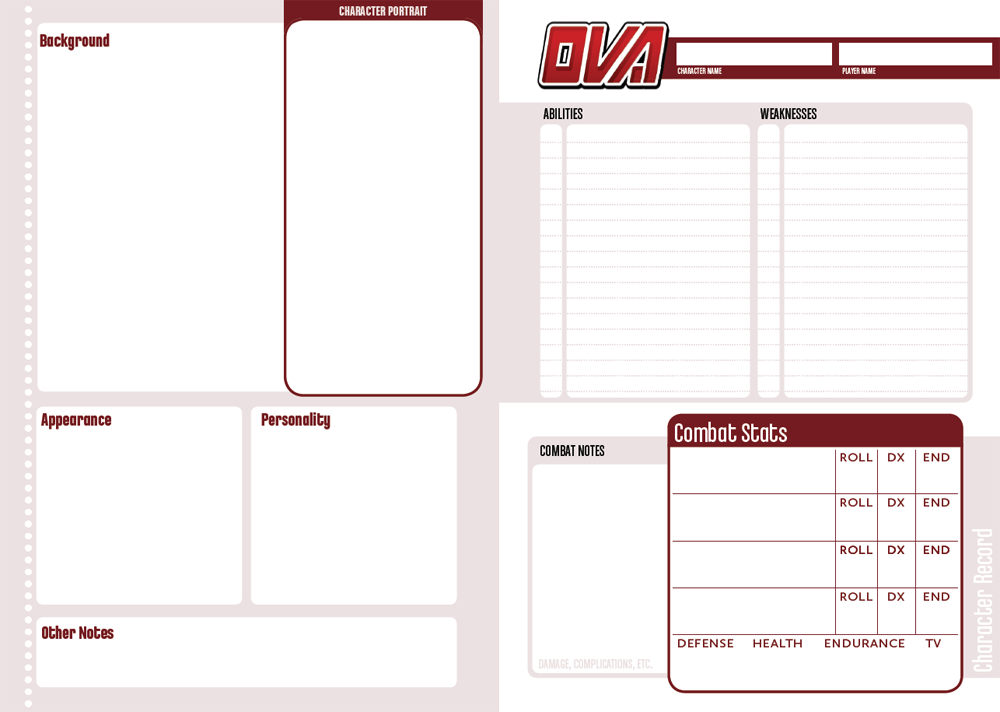
Hey everyone. Not a lot in the way of news, but I thought I'd give you guys a look at the new character sheet. (You'll be the first!) I would appreciate any critiques you have.

The idea is this sheet can be folded in half, and you can write additional notes in the inside of your little "book" and stuff you don't reference constantly (the bio) will be relegated to the back cover.

It's not final. Still tweaking the size of various blanks.

Image
Dreamstryder
Worthy Tortoise
Posts: 51
Joined: Thu Aug 17, 2006 4:23 pm
Location: OR, USA
Contact:

Re: OVA Character Record

Post by Dreamstryder »

Snazzy so far, but... the column of circles on the right bothers me. How would a column of horizontal rectangles or thick lines instead (rounded-corner or otherwise) look?
Clay
Dangerously Sane
Posts: 1282
Joined: Sun Jun 27, 2004 4:32 pm
Location: Nowhere-land
Contact:

Re: OVA Character Record

Post by Clay »

I'm not sure what you mean. If you mean the rule of dots to the left, it's a reiteration of a design element featured throughout the book. You can see said dots in action here: http://www.nikogeyer.com/blog/ova-spread1.jpg

But maybe I'm just misunderstanding what you mean. Could you clarify?
Dreamstryder
Worthy Tortoise
Posts: 51
Joined: Thu Aug 17, 2006 4:23 pm
Location: OR, USA
Contact:

Re: OVA Character Record

Post by Dreamstryder »

I apologize in advance for the post-full, Clay. ;)

Yes, sorry, the dotted line on the left. I'm not a fan of the dots on the page layout either (the only thing I dislike about it), and I may have to do a mock-up to explain better, but, for now, all I can do is show you 2 horizontal lines:

o o o o o o o o o o o o o o o o o o o o

||||||||||||||||||||||||||||||||||||||||||||||||||

#1 is what we have now; #2 is what I think would look better (you can vary the thickness of the bars, try them with rounded corners or straight corners, to see what looks best). This type of line can bend around soft corners, too, if you widen the lines at one end.

Line #2 also seems, to me, to harken back to the Nintendo NES cartridge and system design as well as the texture along the left side of the Sega Genesis/Mega Drive (web search to see what I mean). You said you were appealing to classic gaming and anime art earlier with the cover, so this is a strong yet subtle touch. It would go straight up and down, like the dotted line does now.
Dreamstryder
Worthy Tortoise
Posts: 51
Joined: Thu Aug 17, 2006 4:23 pm
Location: OR, USA
Contact:

Re: OVA Character Record

Post by Dreamstryder »

I've attached tweaked mock-ups of both character sheet and book spread. See if you like either better than its original. :)
Attachments
rulebook spread with tweaked dotted lines
ova-spread2.jpg (172.54 KiB) Viewed 9035 times
character sheet with tweaked left edge
OVA-CharacterRecord 2.jpg (78.94 KiB) Viewed 9035 times
Clay
Dangerously Sane
Posts: 1282
Joined: Sun Jun 27, 2004 4:32 pm
Location: Nowhere-land
Contact:

Re: OVA Character Record

Post by Clay »

Ah, the look for the character sheet is nice! Reminds me of a film strip border or some such. However, I really dislike your suggestions for the book proper, so I'll probably stick with my dotted line. I hope you don't find it TOO offputting.
Dreamstryder
Worthy Tortoise
Posts: 51
Joined: Thu Aug 17, 2006 4:23 pm
Location: OR, USA
Contact:

Re: OVA Character Record

Post by Dreamstryder »

Hah! No problem! Happy I could be of service. :D
Post Reply