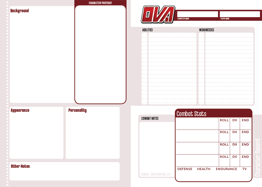
I apologize in advance for the post-full, Clay.

Yes, sorry, the dotted line on the
left. I'm not a fan of the dots on the page layout either (the only thing I dislike about it), and I may have to do a mock-up to explain better, but, for now, all I can do is show you 2 horizontal lines:
o o o o o o o o o o o o o o o o o o o o
||||||||||||||||||||||||||||||||||||||||||||||||||
#1 is what we have now; #2 is what I think would look better (you can vary the thickness of the bars, try them with rounded corners or straight corners, to see what looks best). This type of line can bend around soft corners, too, if you widen the lines at one end.
Line #2 also seems, to me, to harken back to the Nintendo NES cartridge and system design as well as the texture along the left side of the Sega Genesis/Mega Drive (web search to see what I mean). You said you were appealing to classic gaming and anime art earlier with the cover, so this is a strong yet subtle touch. It would go straight up and down, like the dotted line does now.